Philadelphia-based Odessa is a renowned global FinTech company with more than 700 employees and customers around the world. They asked Evviva to refresh their wordmark.
Challenge
Founded in 1998, Odessa Technologies was an innovating pioneer in the specialized world of leasing. But as the company closed on twenty years of age, the logo and name were both in sore need of an update.
Process
We conducted a competitive review of Odessa Technologies’ positioning relative to their competition, interviewed company leadership, current customers and prospects. We learned that, while the company was well-respected by users, prospects who did not know the company associated the name with the place, not the service. A we learned that “technologies” added to the confusion, making people think the brand meant “technologies from the city of Odessa.”
Solution
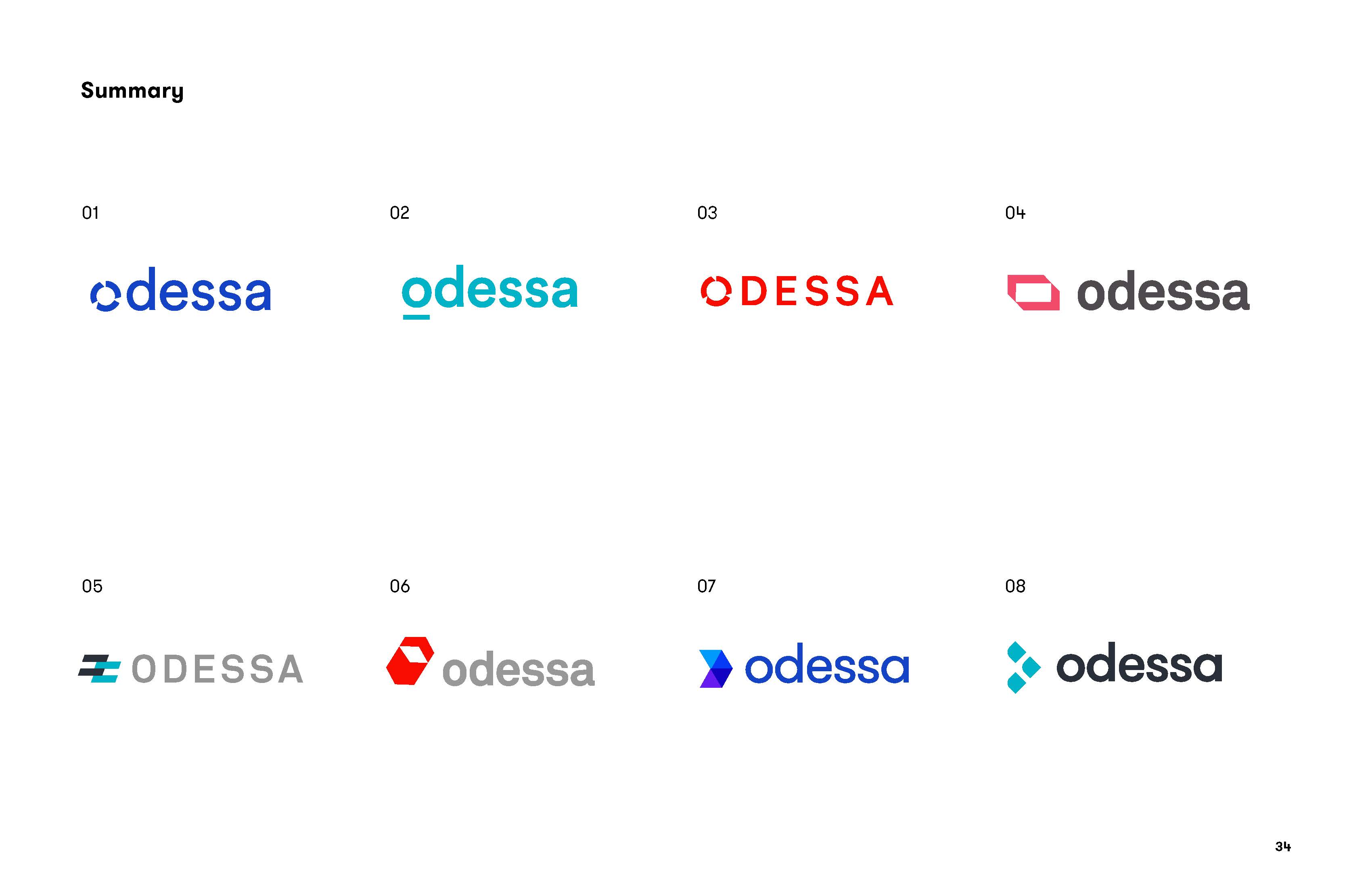
Since “technologies” neither clarified nor differentiated, we advised shorting the name simply to “Odessa.” We developed a variety of sophisticated, contemporary logo treatments with fresh, attractive color palettes:
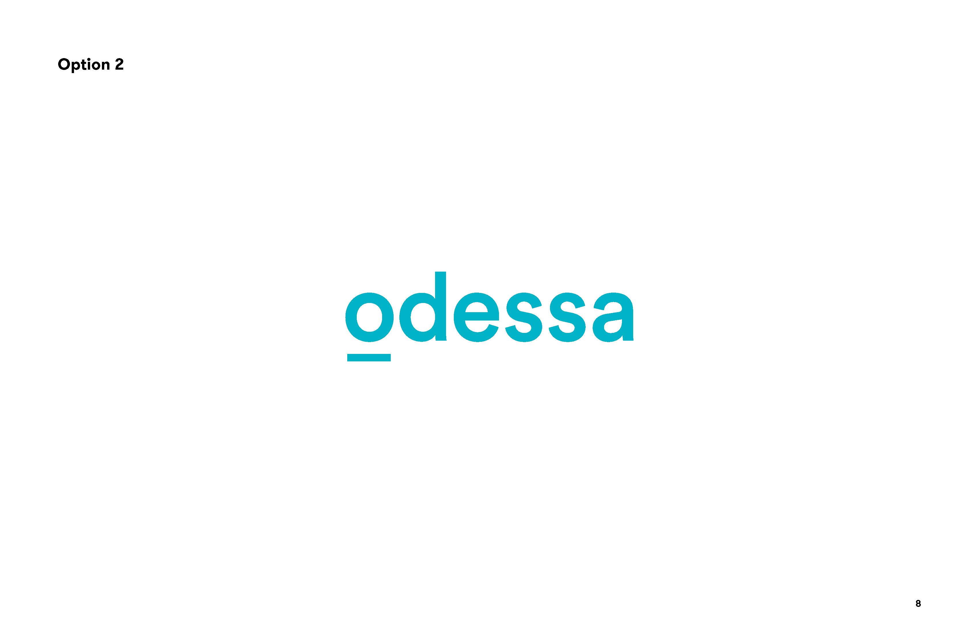
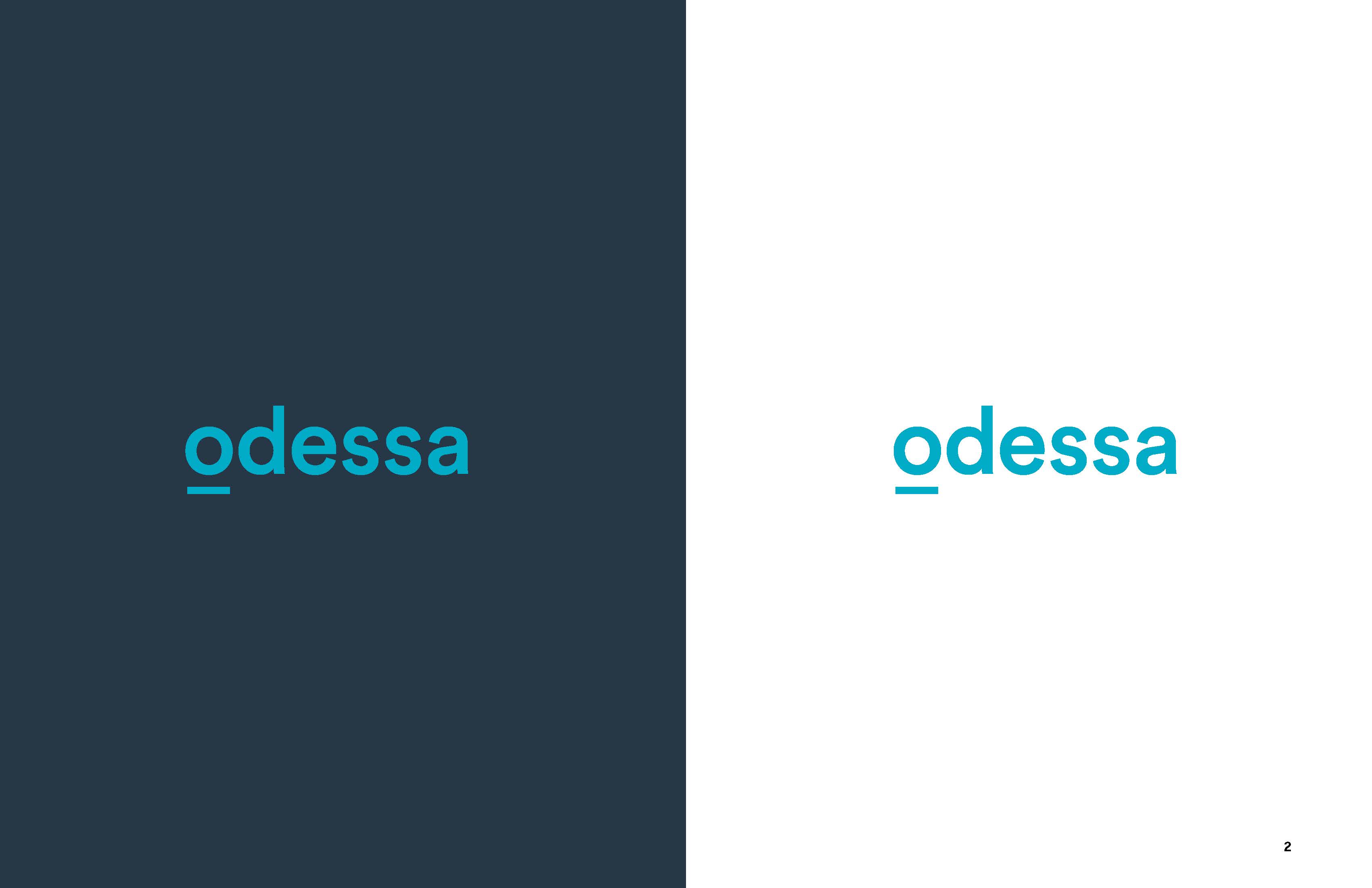
 Odessa selected their favorite mark:
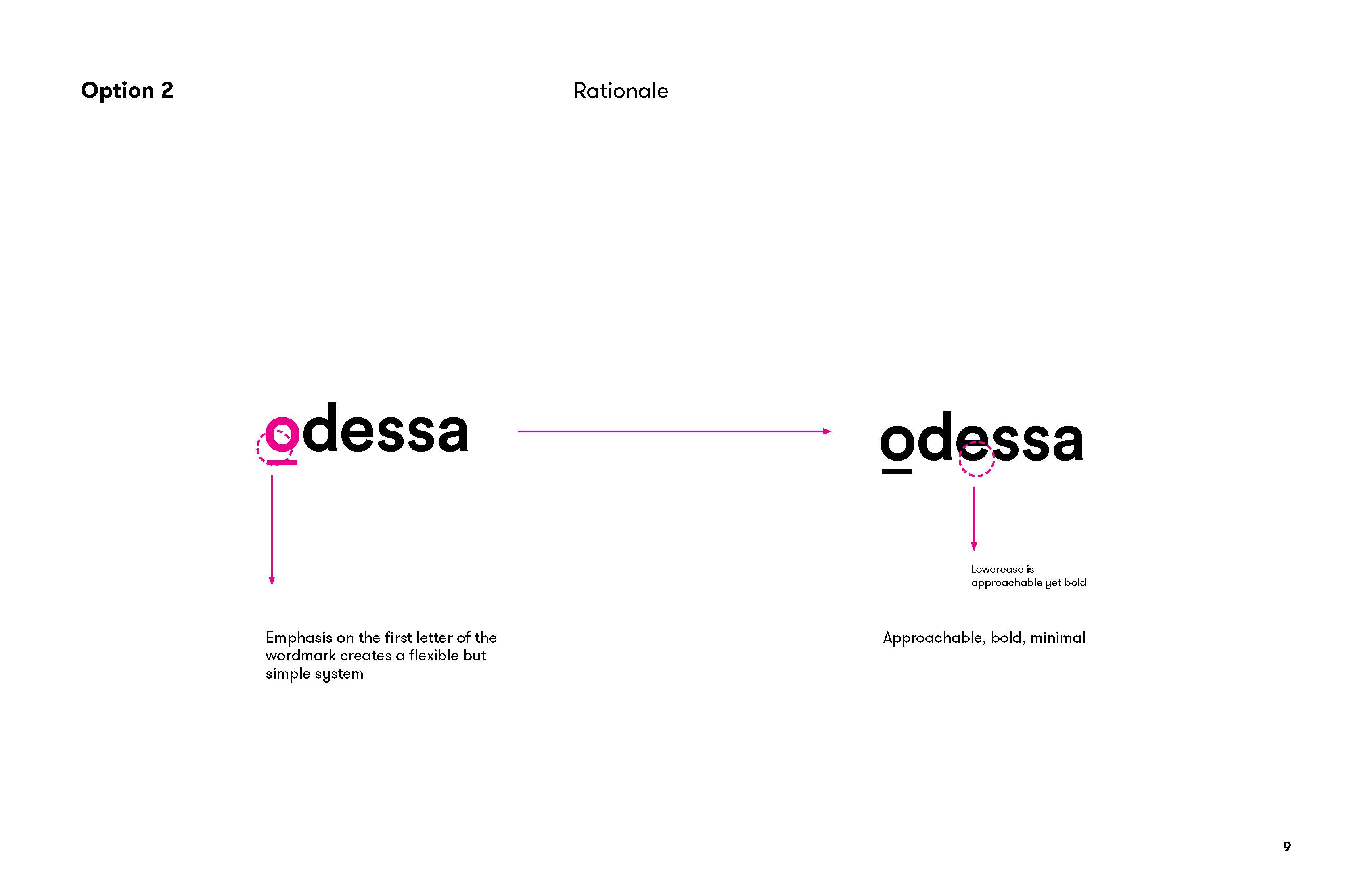
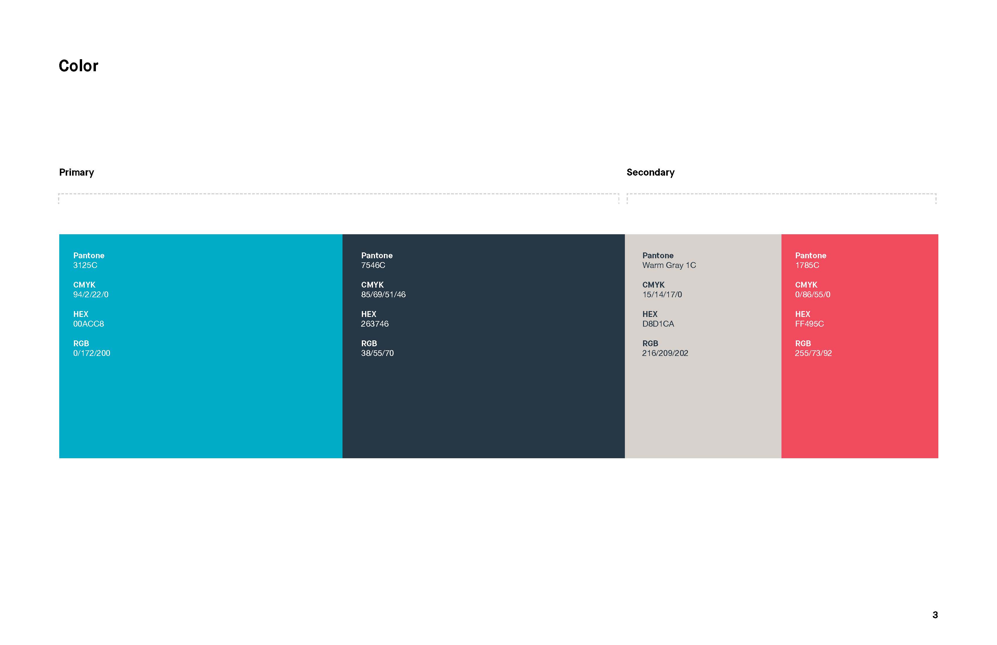
We worked together to refine it and to get the primary and secondary brand colors just right:
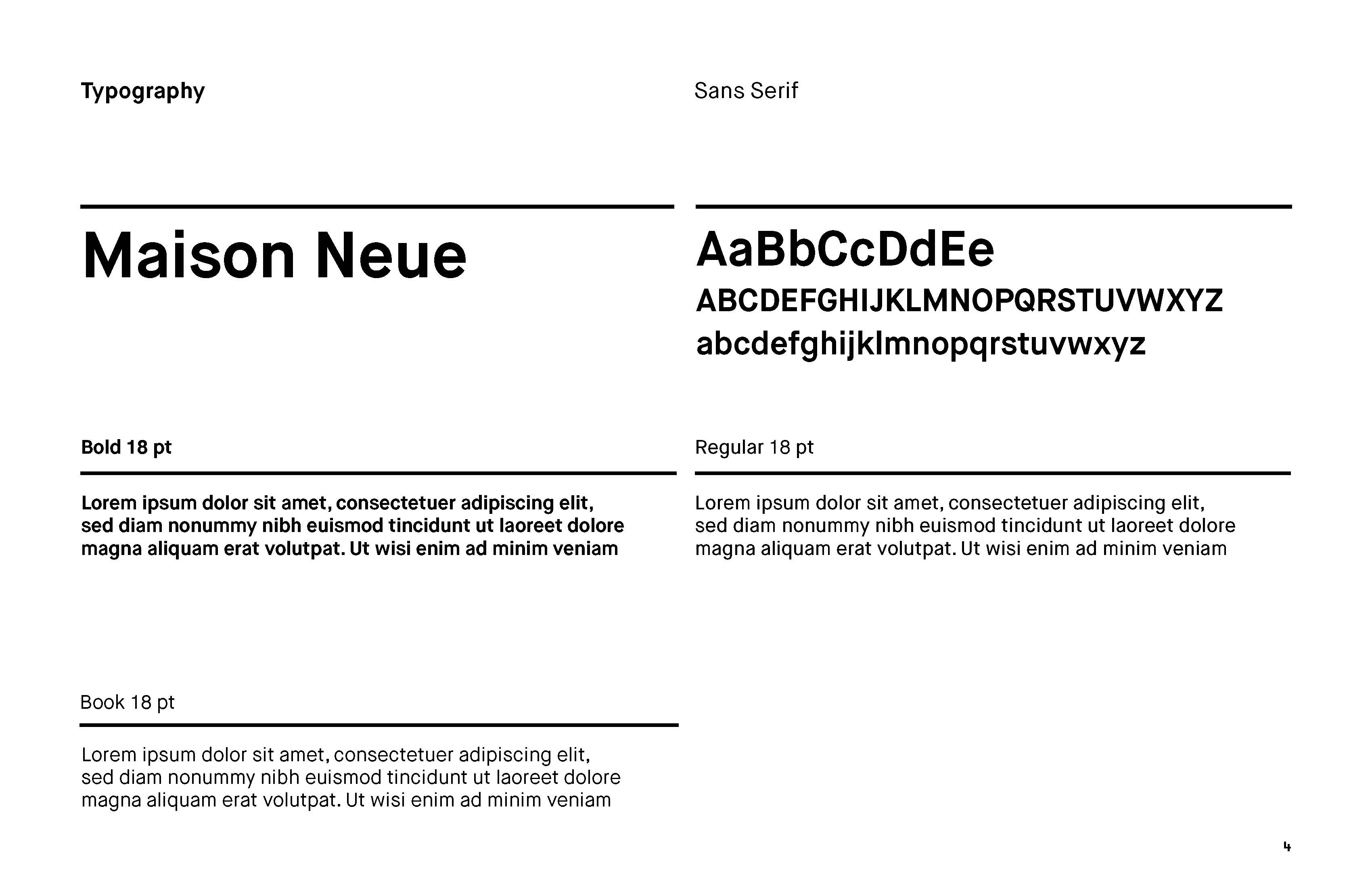
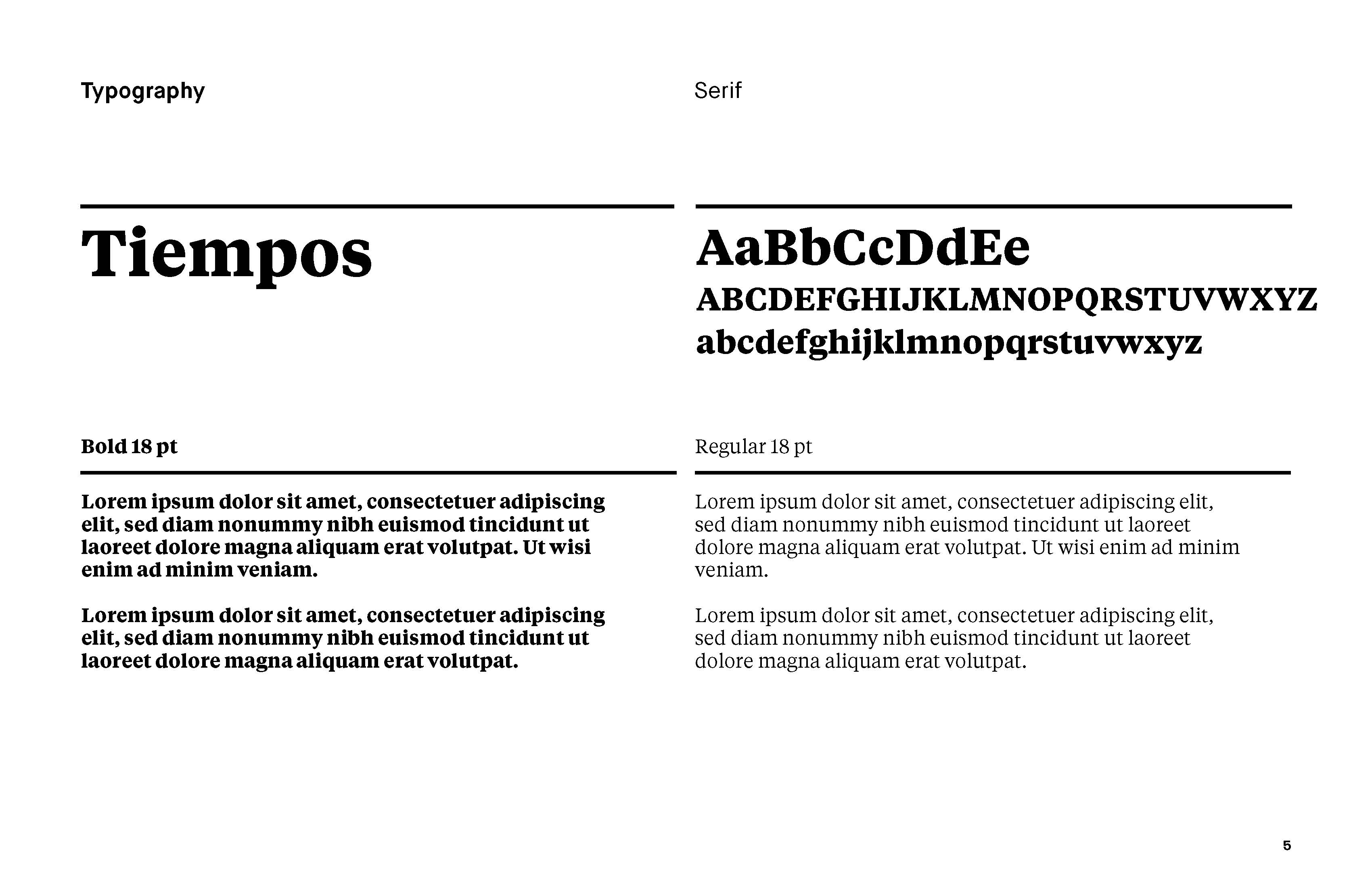
We developed recommendations for typography to support the new logo in their Odessa’s print and OOH advertising:
We integrated the new mark with their existing design system:
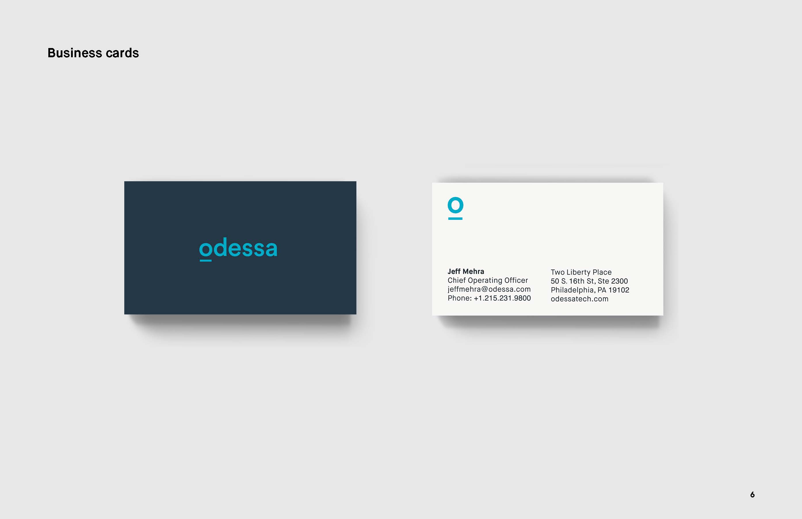
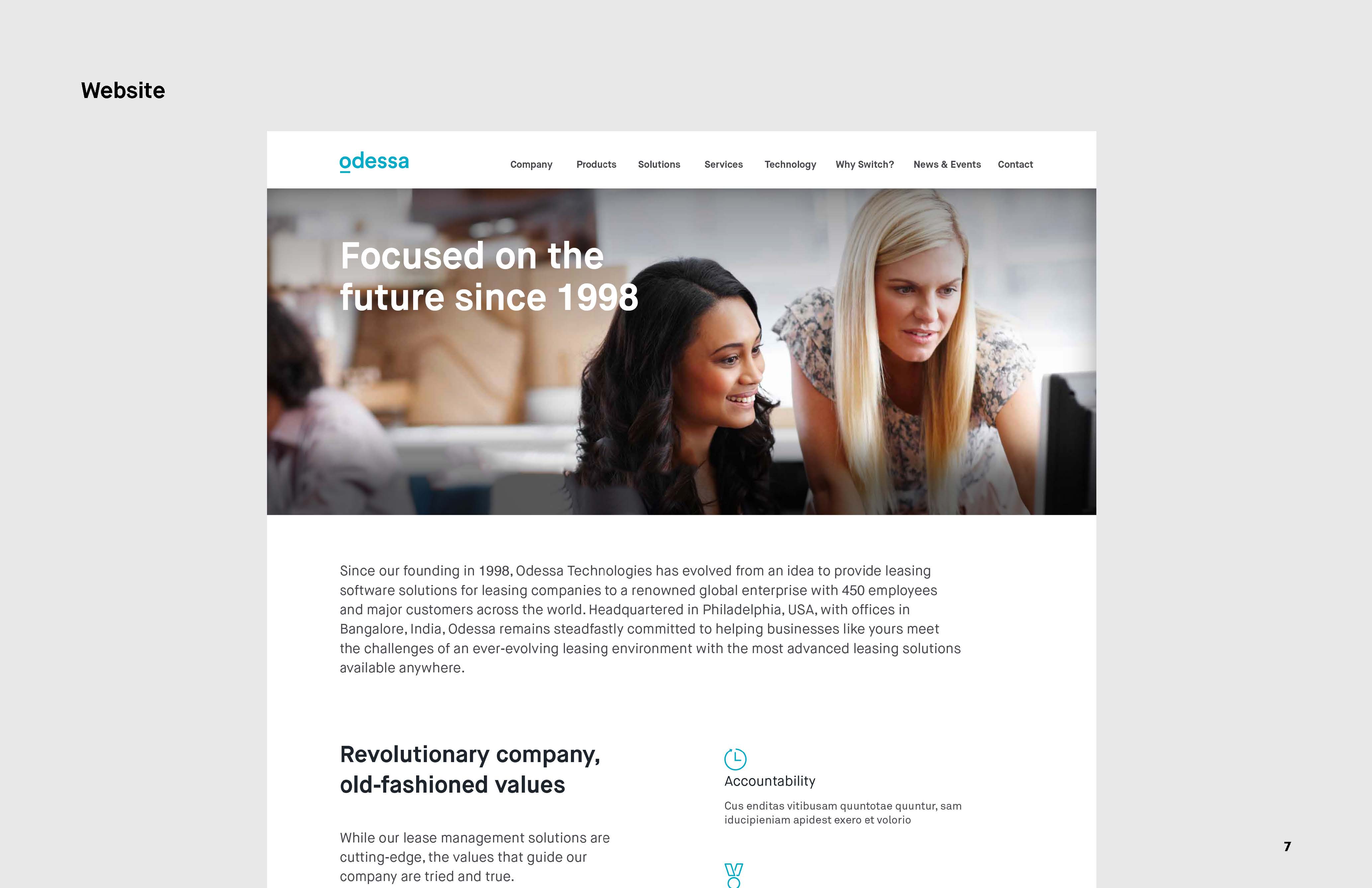
Odessa was delighted with the work and has subsequently rolled out the new look across all the company’s online, print, OOH and trade applications.


